About the Game
Escape a chaotic alien planet by fighting through hordes of frenzied monsters – with your friends, or on your own. Combine loot in surprising ways and master each character until you become the havoc you feared upon your first crash landing.
Platform(s): PlayStation 5, Nintendo Switch, PlayStation 4, Xbox One, Microsoft Windows, Xbox Series X and Series S, Google Stadia
Type: Third-person shooter, multiplayer, single-player roguelike
Engine: Unity
Project Timeline: 6 Months
Team Size: 5
Role(s): Feature Designer & User Experience Design
Links: Steam

Design Process For: Umbrella Features
UX Research
User Research was conducted through four different methods.
Method 1: Stakeholder Expectations
The stakeholders were consulted on their expectations of what their highest priority features were, including a pivot when the stakeholder ownership changed, and kept appraised of the list of features the development team chose to move forward with within the budget, scope and timeline outlined in the contract.
Method 2: Playtesting
Playing through the game over the course of several weeks, designers and engineers established critical friction points within their gameplay experience creating an outline of easy wins to more massive undertakings that would take up more of our established scope.
Method 3: User Feedback
From forums to playthroughs to steam reviews, negative and positive feedback was taken into account. A document was created outlining each major point of friction in the gameplay and compared to the Stakeholders established expectations.
Method 4: Mods
As an IP with a well established community, there are a great deal of mods in existence addressing player frustrations. The team took these mods into account when creating the proposed feature list and presented the, in most cases millions of downloads, as a proof of priority.
The Stakeholders final request was that all the approved features were to be completely within the users control to be turned on or off. With the team aligned we began drafting design documentation and UI/UX mockups.

Feature 01: Difficulty Bar Effects
Identified Friction Point: Lack of Feedback during Difficulty Transitions
ROR2 gives little indication that there has been a difficulty increase. To counteract this, additional audio was added utilizing existing audio effects within the game and mild visuals indicators, specifically a flash to draw the users attention.
Tested during boss fights, the effect stood out during beginning stages of the game when the chaos of combat was at its least overwhelming but the most impactful time to be aware of the difficulty.

Identified Friction Point: Lack of Feedback from Directional Damage
There are multiple creatures that are prone to shoot players in the back or at a distance and have a reputation of blindsiding the player. A directional indicator was added with a red splash on the screen in the direction of the enemy.
This feature in particular was thoroughly tested during combat due to concerns of it overwhelming the players HUD and tuned accordingly.
Feature 02: Directional Damage Indicator

Feature 03 & 04: Inventory & Pause Toggle
Identified Friction Point: Viewing Your Inventory
To view the inventory, players must press and hold the TAB key. This is an intelligent design for when players a dealing with fast paced gameplay but resulted in a lack of use as the game continued to progress despite a menu screen being open.
To improve readability and comprehension of items, the ability to toggle the menu was added for both multiplayer and single player game modes in addition to a pause option that must be agreed upon by all players in a multiplayer setting as it will pause the game for all parties.
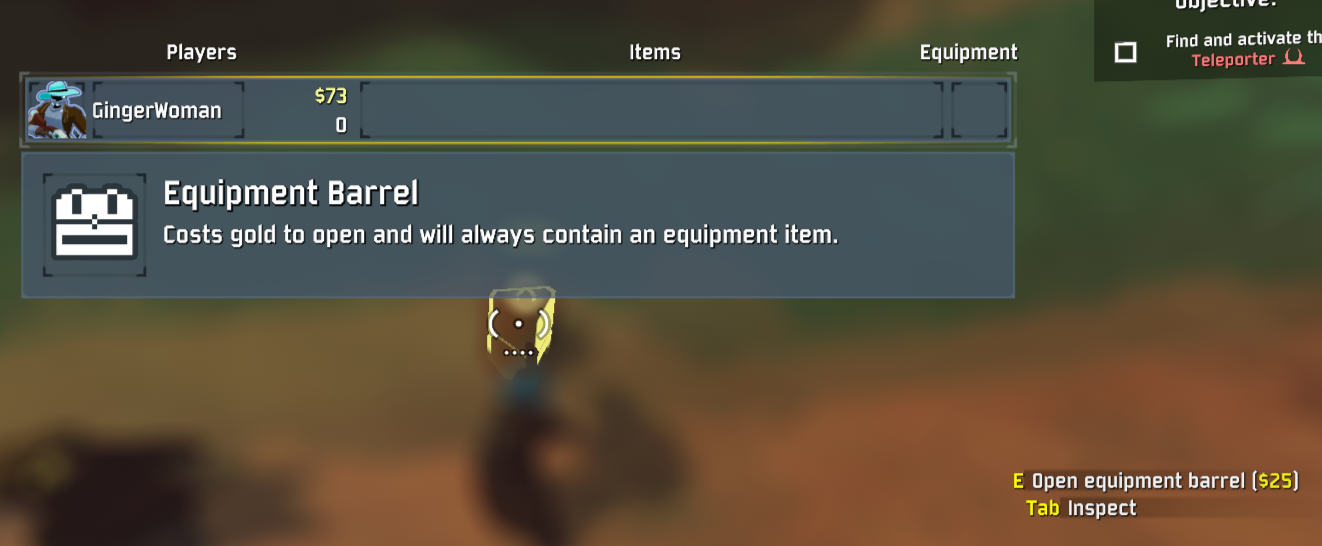
Feature 05: Inspect
Identified Friction Point: Item Descriptions & Chest Information
The largest request from both the Stakeholders, Community and our own teams playthroughs was the lack of information available for an item. Upon our deep dive of this particular friction point, it was noted that players will either have the Wikipedia page open to view item descriptions while playing, download a mod to provide the information or have played enough of the game to inherently just know the information.
To remedy this, an inspect feature was added, this would allow players to quickly and easily access information on the item and make character-building decisions quickly without breaking the immersion of gameplay. This was the largest feature in our scope and required significant rework behind the scenes in addition to multiple UI/UX iterations to achieve the final result.
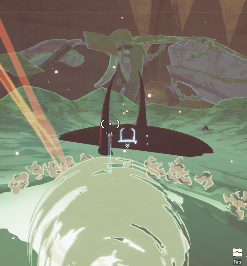
Feature 06: Teleporter Discovery Indicator
Identified Friction Point: Teleporter Location
One of the biggest frustrations expressed by players, especially new players, was losing the teleporter after finding it.
This had the simplest remedy of all proposed solutions as, upon discovery or entering close proximity of the teleporter, an indicator will appear on the HUD and remain for the rest of the level.
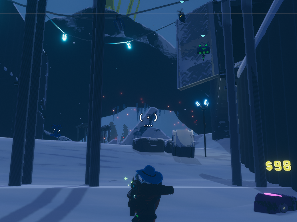
Feature 07: Teleporter Particles
Identified Friction Point: Teleporter Location
In addition to Feature 06: Teleporter Discovery Indicator, it was noted that the particals at the teleport locations were incredibly small and difficult to see. To aid players in the discovery of the teleporter, the size and density of the particles were drastically increased, allowing players to spot the general location from some distance away.

Feature 08: Warning Shot
Identified Friction Point: No warning shots when getting shot in the back
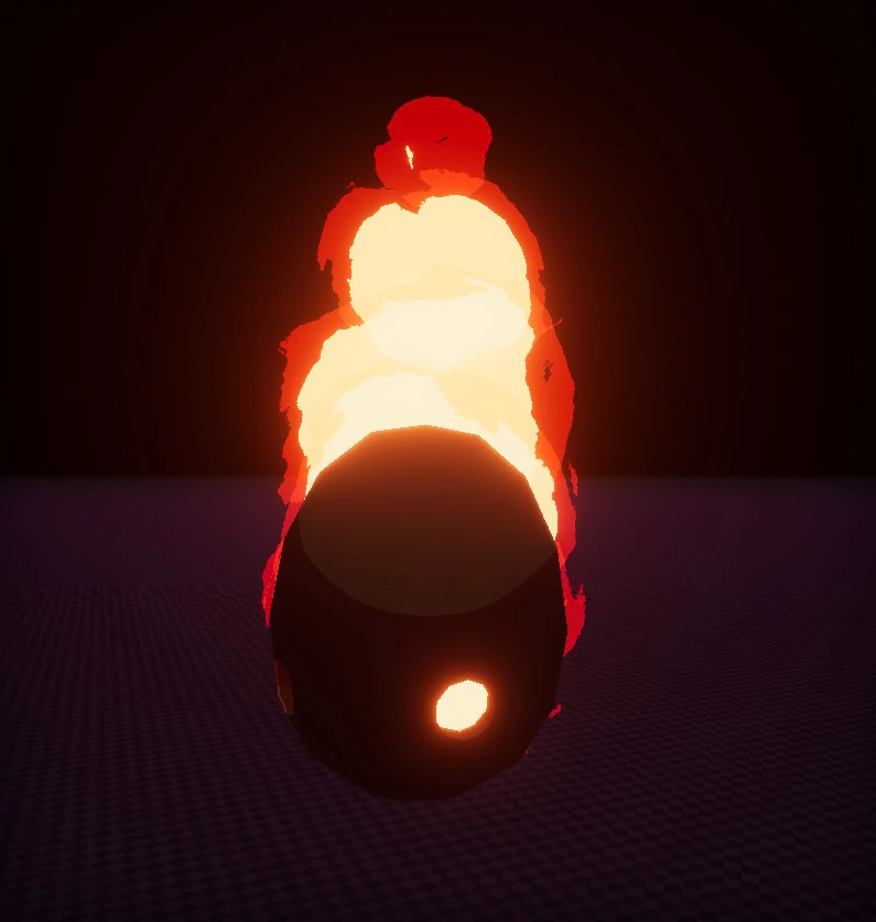
Certain enemies did not alert the player to their presence through audio cues (either too far away or too quiet over other sound effects) and could one shot the player at low health with no warning. Specifically, the enemy most common for this being the Blind Pest, though many flying enemies were prone to the same issue.
Enemies were given a warning shot when behind the player, this was not a feature of the Umbrella Settings but a mandatory built in fix to improve the player experience.